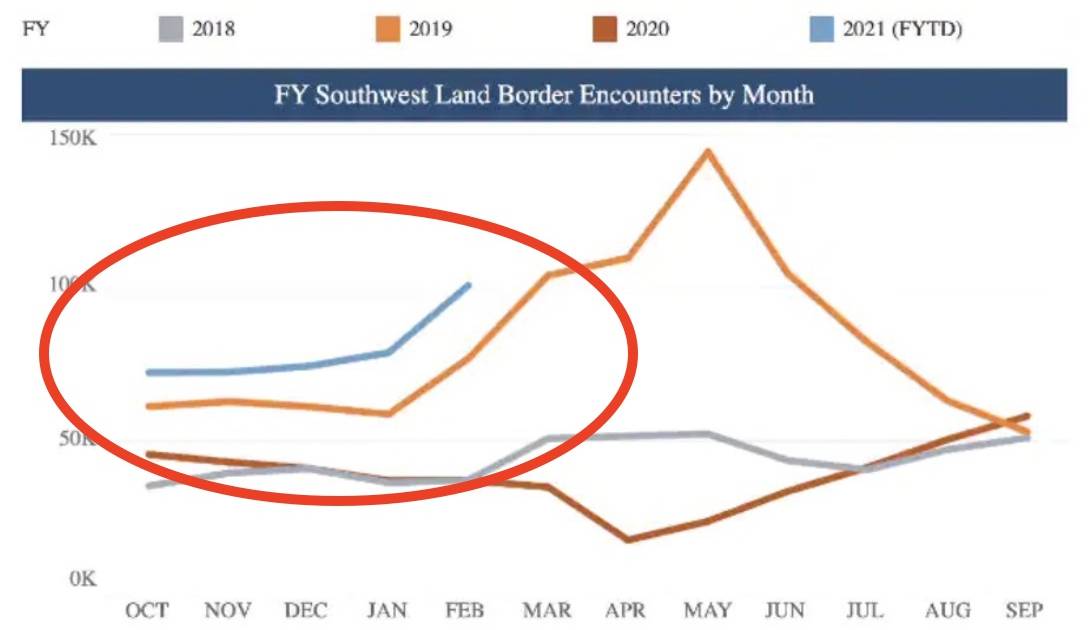
The Washington Post’s Tom K. Wong went through great pangs on Tuesday to write a story saying there was no “surge” in immigration at the Southern border. There’s only one problem…the graph he used in the story to prove his point actually showed a surge in immigration!
“There’s no migrant ‘surge’ at the U.S. southern border. Here’s the data,” the headline reads. And yet the graph in the story shows that apprehensions at the border are up compared to both last year AND 2019.
Zaid Jilani (whose article from today you should read) points out the contradiction:
“See the blue line in *their* data for 2021? It’s above the line for previous years,” Twitchy points out.
Wong, however, doubled down. You can see his mind-bending logic over at Twitchy. But be careful, it might make your head hurt.

